Making candidate assessment easier to manage
Choicefy is a tool for hiring teams who need to create assessments, review responses, and keep track of candidates throughout the hiring process. I designed the product from the first assessment setup to the final review stage. My focus was to make a detailed process feel easier to follow for both hiring teams and candidates.
Role
Product Designer
Scope
Product strategy · UX/UI design · Design system
Focus
Candidate assessment experience

Hiring teams often work with a lot of applications at once. Creating assessments takes time, candidate data lives in different places, and comparing people fairly can be difficult.
Choicefy was designed to bring those steps together in one product.
THE IDEA
Help teams spend less time managing assessments and more time reviewing people.
The product gives hiring teams a simple way to create an assessment, send it to candidates, and review the results in one place.
01
Create the assessment
Start with a blank assessment, use a template, or let AI help with the first draft.
02
Give candidates a clear experience
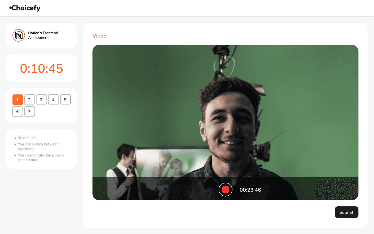
Candidates can complete written, timed, and video questions in one focused flow.
03
Review the results
Teams can look at scores, responses, and candidate details without switching between tools.
DOUBLE DIAMOND METHOD
I chose the double diamond approach because it clearly distinguishes between exploring and refining ideas, leading to better problem solving.


THE EXPERIENCE
Start with the role
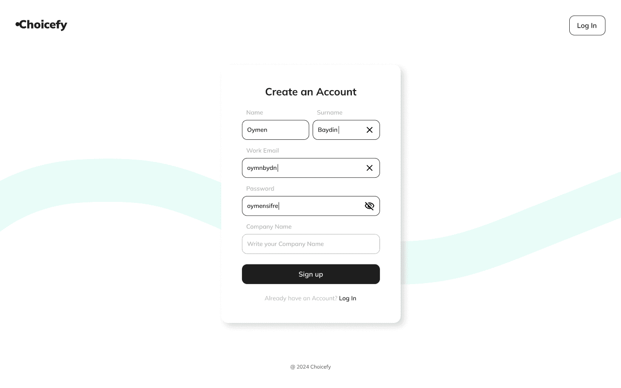
Hiring teams can create an assessment from scratch, choose a template, or use AI to generate a starting point based on the role.


Build the assessment
The question builder helps teams add, edit, and organize questions without making the process feel overwhelming.
Complete the assessment
Candidates move through a clean flow that supports different formats, including written questions, timed tasks, and video responses.

DESIGNING FOR
People who need to make careful decisions in a limited amount of time.
Choicefy was designed for hiring professionals who need a clear view of each candidate without adding more work to their day.

Sophia Martinez, 29
HR Specialist · Remote
“I want to move quickly, but I also need to know I am giving every candidate a fair chance.”
What Sophia needs
A quick way to create assessments
A simple way to follow candidate progress
Clear information when comparing candidates
VISUAL SYSTEM
Clear enough for detailed work. Warm enough to feel approachable.
I used orange as the main brand color to bring energy to the product. Neutral surfaces keep the focus on assessment content, candidate information, and results.
Choicefy Orange
Hex: #FF6A2A
Purple
Hex: #7F43BC
Blue
Hex: #434FBC
Green
Hex: #1AC39E
Dark
Hex: #1E1E1E
Dark Grey
Hex: #9B9B9B
Grey
Hex: #E6E6E6
Absolute White
Hex: #FFFFFF
TYPEFACE

I designed this logo to embody Choicefy’s friendly, people-focused values. The human-like icon and vibrant orange convey energy, creativity, and trust, while the sleek typography ensures a modern and memorable identity.
SCREENS



OUTCOME
Choicefy gives hiring teams one place to create assessments and review candidates. The goal was simple: make the process easier to manage, easier to understand, and easier to use when decisions matter.